
Every week, we'll be sitting down with one of our gallery artists to discuss their work, process, inspiration, and stories. This week we're speaking with Joanne Freeman.
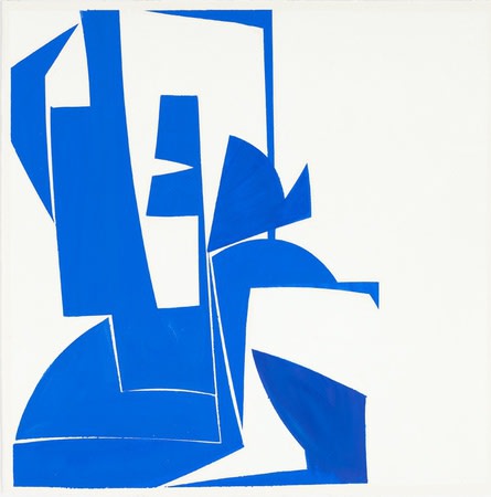
"Covers 24 Blue"
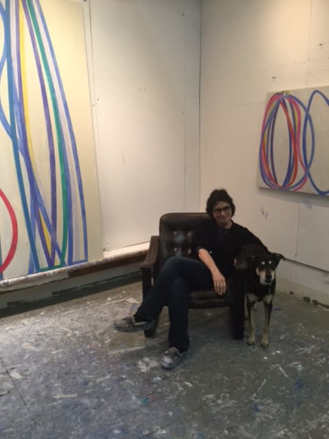
Joanne Freeman strives to reduce her visual language down to its essence, offering up a quiet but confident impact. Her color statements against stark white backgrounds are at the intersection of geometry and gesture, their whimsical appearances supported by precise, controlled mark making. Excited by the convergence of fine art and pop culture, Freeman's works reference modern design, the Adriatic coast, and rock and roll. Just in time for her solo show, "New Paintings and Drawings," opening this week, we headed to Freeman's studio in SoHo where we sat down with tea, scones, and her dog, Coco, to discuss her latest work.
What are your earliest memories relating to art?
I grew up in Newton, Massachusetts, and my parents would take me to the museums around Boston. I took figure drawing and printmaking classes at the Museum of Fine Arts when I was around 12 or so, and when I wasn't in class I could wander the collection, which was great. They had a ton of Monets, they had the haystacks. They also had these period rooms where you could go and look at how people lived in these different time periods, which was really fun for me and I think how I got interested in design. I also have an older cousin who was an art teacher and an art major in college, and she would take me to the Rose Art Museum at Brandeis, and that was unbelievable because at the time they had an incredible curator there and I got to see, at a very young age, all of the Pop artists. He had Warhols and Lichtensteins, and this was the '60s and '70s so it was while it was all happening. It was such an important collection, and it allowed me to see Warhol's influence on all the aesthetics of the time, how it was all connected. There was a revolution happening, aesthetically and politically, and I was introduced to it through those visits.
Do you think there was a blending of those two influences once you started becoming an artist yourself? A meeting of the fine art and design at the MFA, and the Pop Art at the Rose Art Museum?
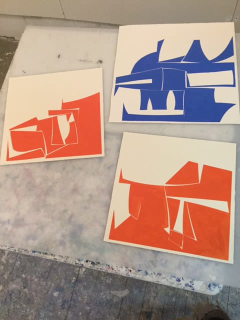
Yeah, I do. The Warhols and that whole poster, Pop, silkscreen type of look to things definitely had an influence on me. You can still see it in the drawings, and also in the way I work in terms of masking things out with tape. At the basic level, my painting is like early silk screening because I'm cutting stencils and pushing paint through. Now everything's gotten so digital, but when Warhol was doing it he was using screens and leaving the mistakes and they actually were rather painterly. I like keeping that feel to it.
Yeah, your work is at that intersection where it appears to be very gestural and spontaneous, but it's actually very controlled and precise because of your process. How did you start working in that style, and how do you reconcile those two seemingly opposite approaches in one piece?
My nature is obsessive. I keep working and working and working on something, and that obsession can get carried away. I think I flourish when I rope myself in and set up parameters, so that process of cutting the shapes and taping the lines are the controls that I set up for myself. It creates a system of limitations so that I can play within those guidelines. I always start out with a bunch of different options and variables, but as I progress with the painting I minimize, and minimize, and minimize so that the painting is very reductive. Then I'll probably start again with a bunch more information and reduce that down until I find the language I'm looking for. I get to balance that intuition with that sense of control.
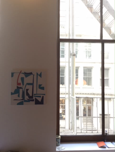
Is the process of the painting becoming reduced what shows across your series? Or does the series begin once you've reduced it down to the essential language you're happy with?
I've been working with series now for about five years, and it's more about the idea that one painting informs the other. I try to work on more than one at the same time, but a very slight variation of composition from another painting will inform the next. Sometimes the new idea will be very drastic to me but it won't be to someone else because it's falling within the same original parameters. My process is a lot about putting something down and then taking it away. There's a lot more information in these paintings that I've edited out by the time I decide the painting's done than what's left in the final image.
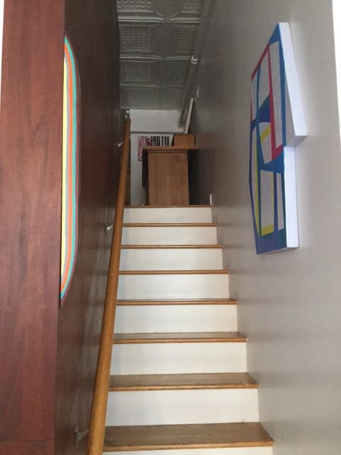
Is it possible to put into words what you choose to take away and what you choose to leave?
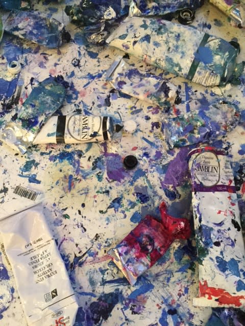
Well, it changes, but it's really instinctual. I work until it doesn't bother me. If something's bothering me, I just have to do something with it. I need to take it away, or add something back. Sometimes I have to remove myself from the studio so I can let something sit because I don't know what it needs but it won't stop tugging at me. That's the process, really. It's working until viscerally it's not bothering me anymore. I do try to leave some of the process evident by using certain transparent paints, like the white I use. So, in some of the paintings I leave some of the ghosts, some of the drips or the painterly aspects. But sometimes I don't! It's a visceral thing. It needs to make sense to me.
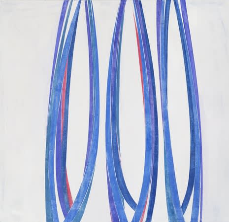
"Reel, Rock, Roll"
A lot of your work, at least in the titles, references music. The Cover series in your show is a nod to album covers, and one of the paintings has the title "Reel, Rock, Roll." You also had an earlier series called "Three Chords," for instance. What is your relationship with music, and how has it influenced your work?
I'm not a musician, so it's all a mystery to me. I'm in awe of it. My response to it is entirely emotional because I'm not at all tied to the process. But I think it's similar to being in the studio. It's this mindset of being somewhat unconscious in your studio when you get into a creative mode and you're not thinking literally or step by step, and you're letting your subconscious take over a little bit. I also like the vernacular of rock and roll lyrics, the street language. I work with the integration of painting as a fine art with popular culture and the language of the street, so those lyrics speak to me in that way and always seem like a good fit for my titles. "No Noise," for example, is a combination of those two influences. It's a reference to a Charlie Parker album, but I'm also talking about that clear thinking in the studio where you've negated out all of the noise of the rest of your life and the rest of your mind, and you can see clearly what's happening with your painting.
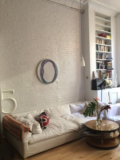
You've also spoken about how your trip to Italy has influenced you.
Yeah, that was a big trip for me. I went on a residency to Otranto, and it was one of those periods in my life when it was a really good time to do it, to get out of my life here and go somewhere new for a month. I went thinking I was going to do something completely different, but of course it changed when I got there. It was the beauty of this place, this coastal town with white facades right on the Adriatic. The light hitting these white facades was just incredible, especially with what it would do to color, and the simple geometry of it. Then with the church there was a lot of colors associated with the religion, and it had no meaning to me, but someone would hang these different colored clothes out of the windows to signify certain holy days, and the color against the stark white was gorgeous. With the residency all you're doing is navel-gazing, so I just decided to follow what was inspiring me: one simple color statement against the geometry of white. I've been working with that idea ever since.
What other things have you been influenced by?
I'm influenced by other painters. Carla Accardi was a big inspiration when I was in Italy. I love Ellsworth Kelly, and contemporaries like Mary Heilmann. I'm also very influenced by design. I'll see a piece of furniture that will blow me away, or a building that's incredible. I live in SoHo, and just walking around, looking in the store windows and seeing what they're doing with design and color, or the fashion that I'm surrounded by. It's hard not to be influenced by it. I'm interested in the Bauhaus teachings of crossing disciplines. I'm really excited that MoMA has started showing paintings against design and starting to talk about how they influence one another. I'm very against the separation of the high and the low. I don't like valuing things based on whether it's functional or nonfunctional. I like to see the convergence of everything.
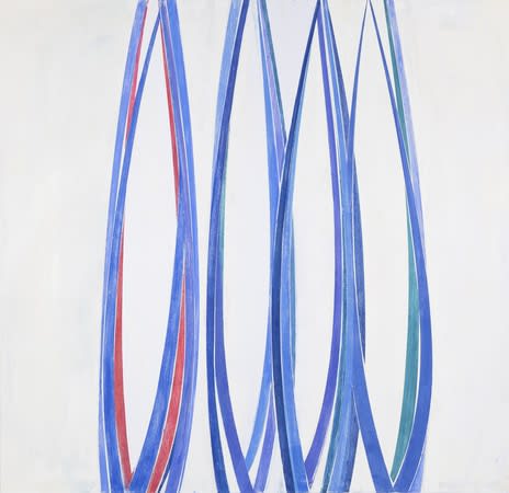
"No Noise"
What do you think the pieces in the show represent about the evolution of your work?
The scale is larger for me, so there's more of an impact that way. The palette is very similar, so I'm thinking about it a little bit as an installation, and how they all relate to each other in the space. These works, they're a synthesis of an idea I've been working on for a while. I took the original seeds of these lines and brought them to their mature, confident level. I've reduced them down, I've reduced the palette down, so it's more of a sure shot. I'd like to get to a point where I'm down to just one color on a canvas with those forms, take it down so the impact is there in that way too. But this is where I'm at now, and I think it gets that message across. It's a sure, confident statement. Hopefully!
It is!
Maybe! A sure, confident statement. Maybe. [Laughs]
I know at first glance it doesn't look like the paintings are in the same vein as the drawings compositionally, but the process is the same, and the sensibility. There can be a funny mindset when something's so direct, when there's a goal of "less is more." There's always a lot of uncertainty and doing and undoing to make that direct, confident mark. It takes a hell of a lot to make a simple statement!
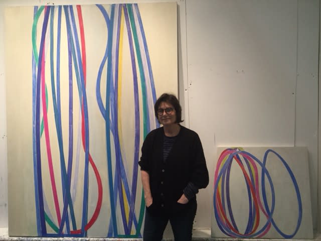
Explore more of Joanne Freeman's work here.
"New Paintings and Drawings" is on view from February 18th through March 26th.
