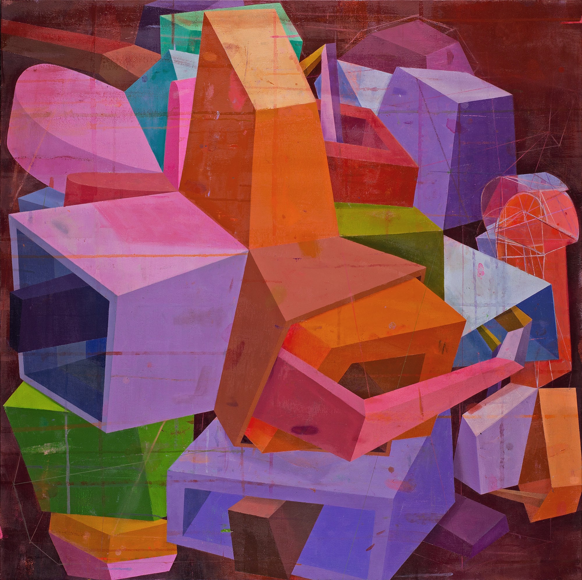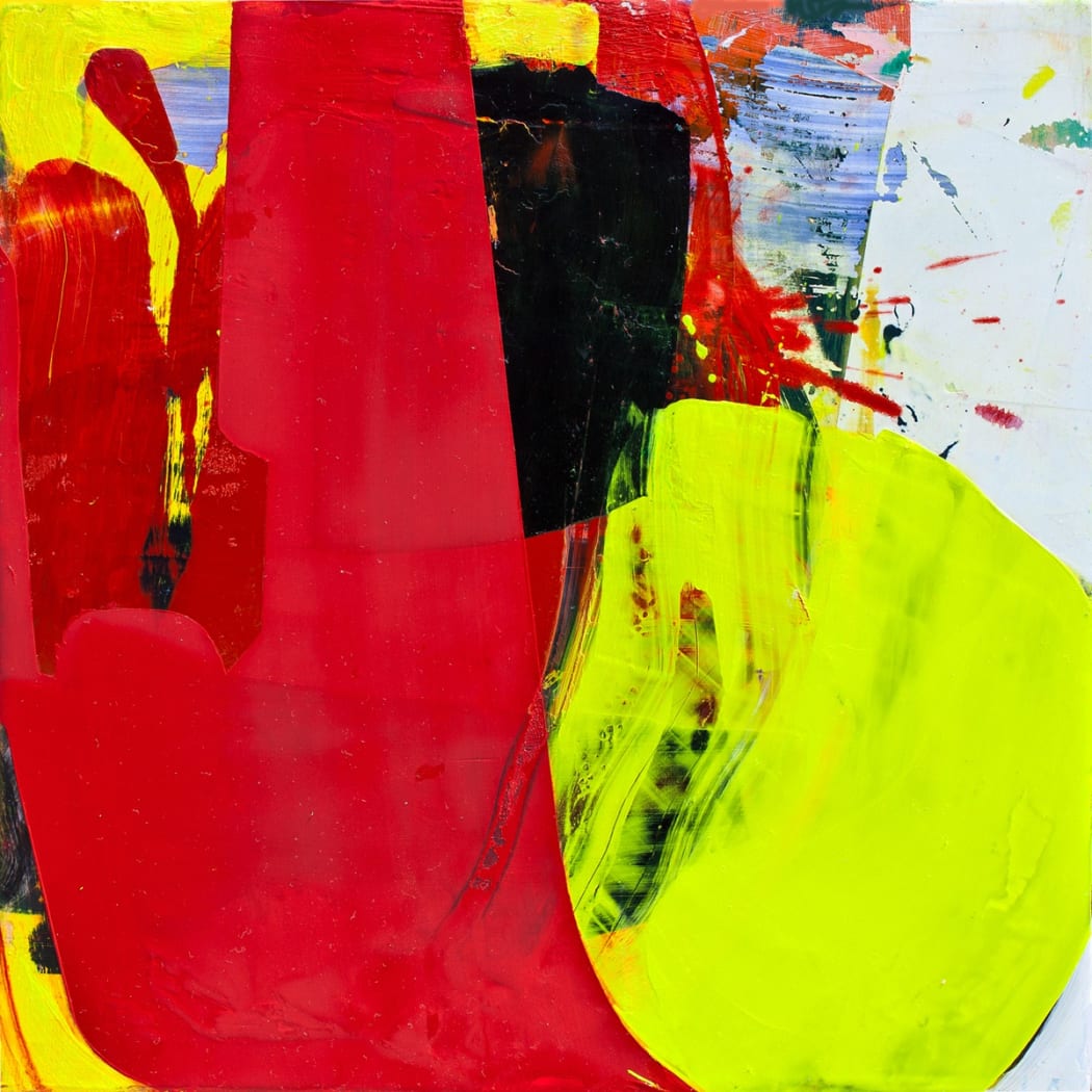
Every week, we'll be sitting down with one of our gallery artists to discuss their work, process, inspiration, and stories. This week we're speaking with Suzanne Laura Kammin.
Suzanne Laura Kammin is inspired by a wide range of influences ranging from Eastern philosophy to 1970's design. The resulting works are intensely vivid studies of color, self, and space that navigate the dynamic between hard and soft edges pushing up against one another within the frame. The juxtaposition of pure color, any evidence of mark-making obscured, and visceral layers creates a visual give and take that nods to the concept of yin and yang, where opposite forces are interdependent. In anticipation of Kammin's upcoming solo show, "I Am That," she talked with us from her studio in Newark, NJ about the spirituality of her work, the evolution of her color sense, and unleashing the freedom in her paintings.
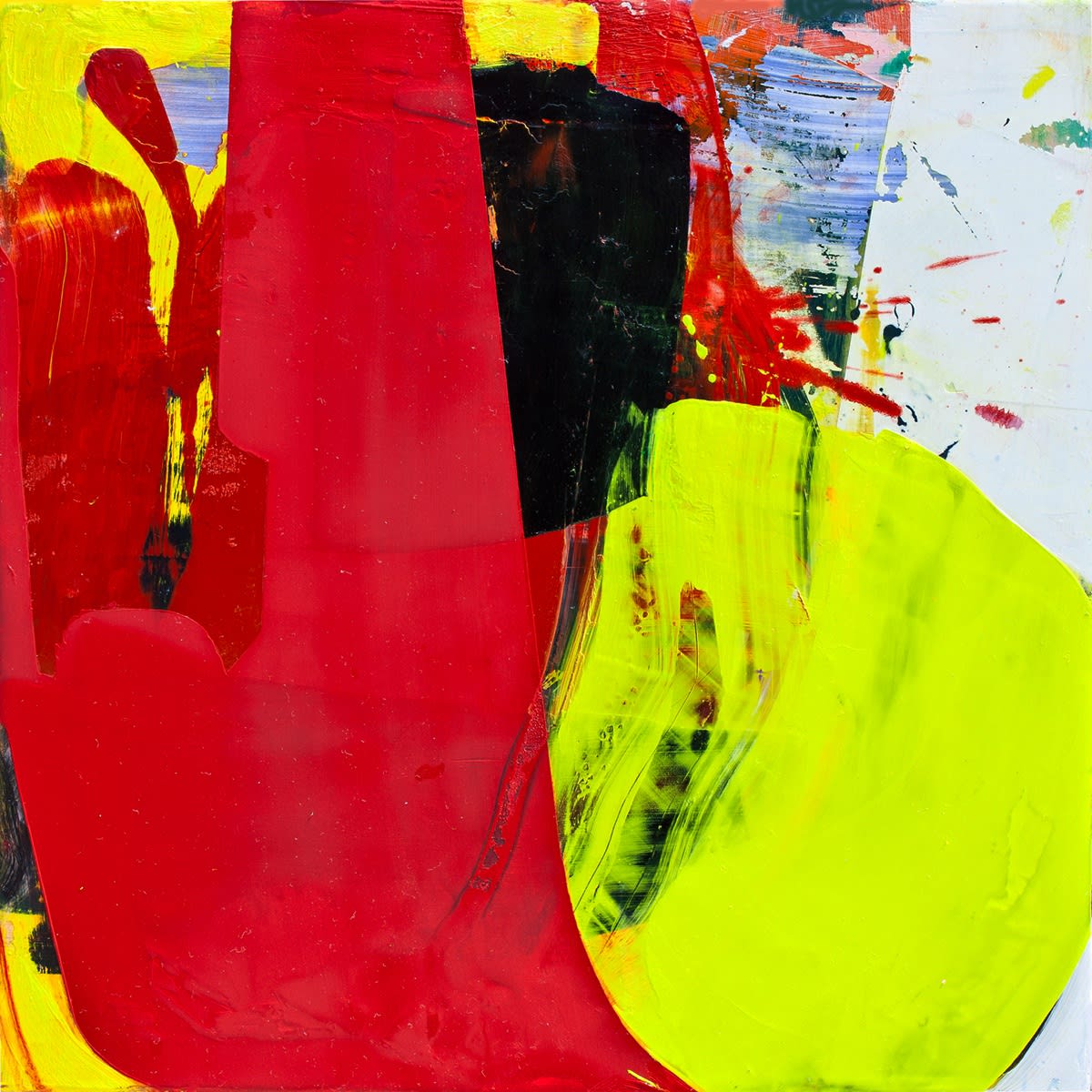
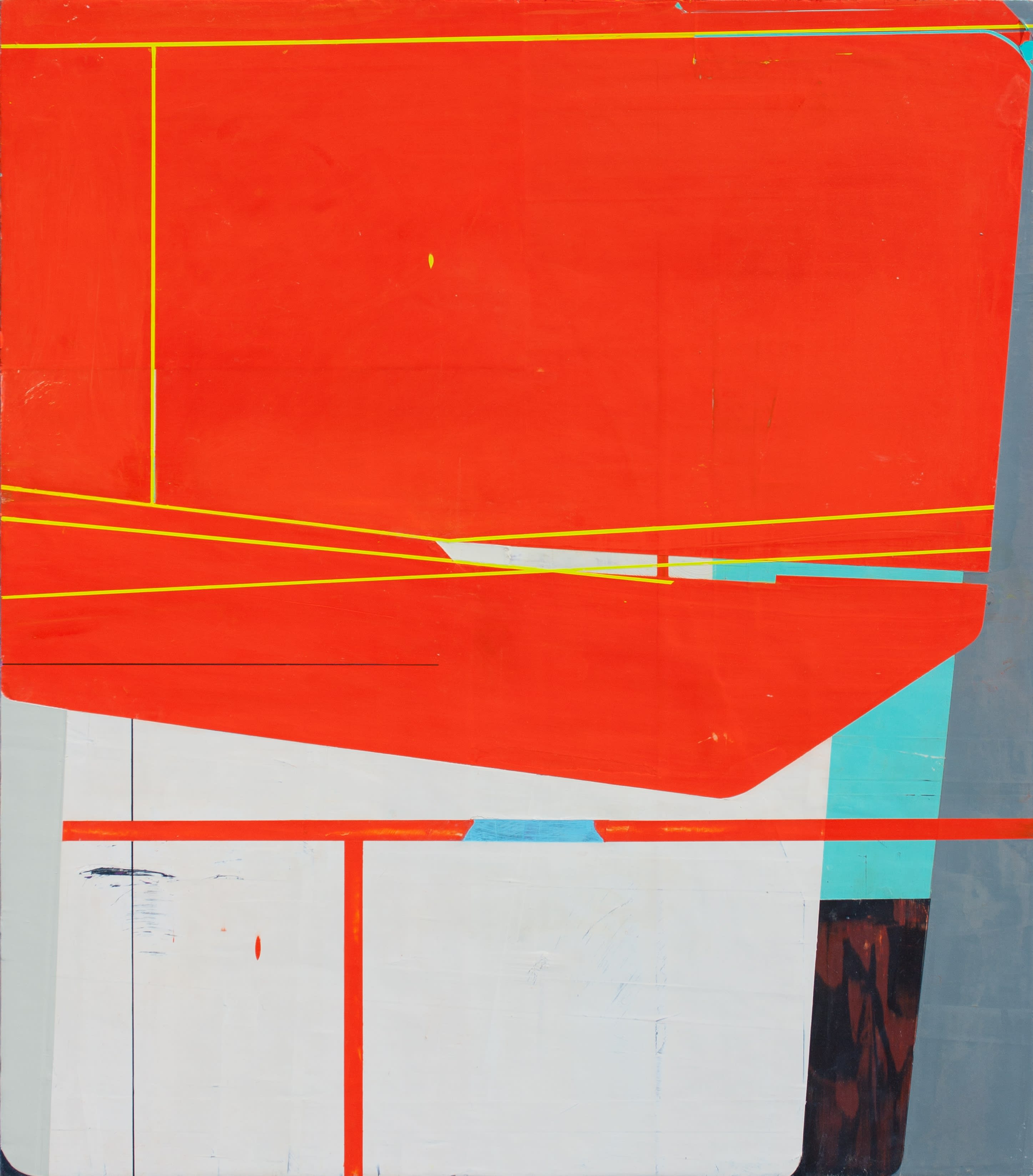
"Rubber Match"
What are your earliest memories relating to art?
I went to museums a lot with my parents when I was a child so I remember being introduced to art through those visits. In terms of making art, among my earliest memories would definitely be my early schooling at The Rudolph Steiner School in New York. Everything we did was somehow creative and most things had a visual component. I remember drawing with amazing, intensely colored, huge stick and block crayons, making figures with translucent strips of colored beeswax, and decorating the borders of the pages of everything we did. We knitted scarves, sewed, and carved things out of wood. I loved it. The expressive aspect of Waldorf education resonated with me. I assume that my time at The Steiner School played a big part in my becoming an artist.
You work to erase any traces of your mark making. Why is it important to you that your process isn't evident?
My approach to process partly comes from my spiritual concerns. I don't want my work to look like it's of the world that we experience as real; I don't want the hand of the artist to be evident. I want there to be a mystery to my work, something that feels magical. I also want vast areas of uninterrupted, pure color - no brush strokes, no texture that speaks of a physical substance. I want to be able to merge with the color. I want the work to feel expansive and enigmatic.
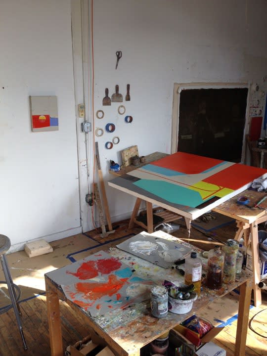
Photo courtesy of the artist
You reference elements of Eastern philosophy as an influence in your work, particularly the concept of yin and yang and the idea of the interconnectedness of everthing. How did you develop your interest in that philosophy?
When I was seven or eight, my parents started doing Transcendental Meditation. I don't know why, maybe it was just because my parents were doing it and I wanted to tag along, but I really wanted to go to meditation class with them. I wasn't able to join them but that memory stuck with me. Then, over twenty years ago, I was diagnosed with Hodgkin's Lymphoma. While it was among the hardest times in my life, it was also transformative. Yoga and meditation became a part of my life, and Western psychology and Buddhist philosophy were the lenses through which I came to understand myself and the world. Recently, I've become extremely involved in meditation; it's the most meaningful thing to me, more so than art really. I love creating but there's a lot of ego involved in exhibiting your work and doing what's necessary to have a career. It's something I struggle with a lot.
Another influence of yours is the aesthetic of the 1970's. What is it about the '70s that inspires you, and how does it reflect in your work?
There are aspects of the '70s aesthetic that creep me out. I found growing up during the sexual revolution to be oppressive and scary in ways, and there are still aspects to design and music from the '70s that leave me feeling queasy. There are other aspects of late 1960's and early '70s design, however, that I loved and that have stuck with me in a good way. I'm drawn to the warm, analogous colors like red, orange, brown, ochre and yellow, and the smooth rounded edges and shiny surfaces of the design. They're friendly. Without doing so overtly, I like to reference those things because they're comforting to me and it's an aesthetic that I think really helped to define my taste in design. One of my favorite colors is what I call "puke yellow", the sort of mustard color you might have expected to see in the upholstery of someone's wreck room furniture. It's a complex color.
"Cat's Cradle"
Your color sense is very bold and intense. Besides those elements of the '70s aesthetic, where else do you find inspiration for your colors?
The evolution of color in my work is interesting. The natural light that was a part of my still life paintings in college continues to affect my color sensibility. In graduate school, however, my paintings grew huge and thick, and the colors became really dark. I painted almost achromatically for years. The colors were nuanced but extremely limited. They were blacks made from umbers, ultramarine blue, and various shades of gray, ranging from warm to cool. The colors were reflective of where I was in my psychological development. The shift from blacks and whites to my current palette happened fairly organically. It was nothing too forced. There were a few years during which I didn't paint much but I was making major changes in my life and personal development. When I came to the studio, I wanted my palette to be joyful and expansive. I do think about colors and palettes from modern design, and I also look at the work of other artists for color ideas. I've expanded my palette a lot over the past few years and enjoy buying new colors to expand the range that's available to me.
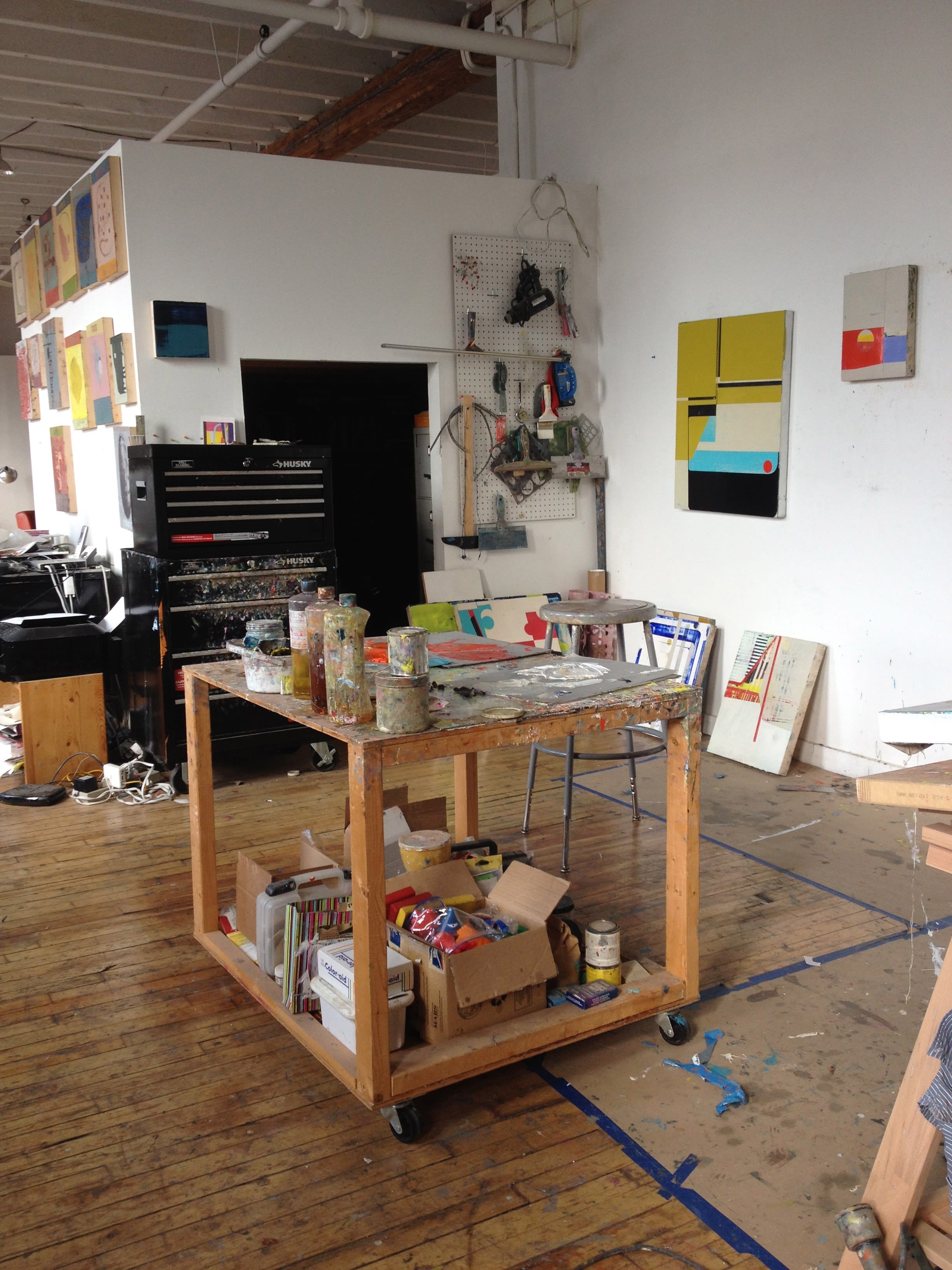
Photo courtesy of the artist
You also founded the Left Bank Studio School, in Newark, which offers painting and drawing classes. Have you found that running the school has affected your work at all?
I wouldn't say that running my own art school per se has affected my work but teaching on the whole definitely has. Teaching forces me to keep looking and seeing and thinking about things that I wouldn't be considering in my own work. It broadens my outlook and keeps me sharp. I sometimes have to paint and draw things for students in introductory courses so I'm building on my observational skills by doing that. It was interesting to me that when I went back to painting after taking off some time, my work was actually better than it had been when I stopped. I didn't just pick up where I left off, my technical abilities had progressed. I credit this to teaching. I internalize and integrate the wide range of things that I address when I teach and end up being able to bring that to my own work.
"I Am That" exhibits some of your latest paintings. What do you think these paintings represent in the evolution of your work?
My work has evolved a great deal in the last year or so. I had worked with squares for many years and returning to rectangles really changed things. The work has moved from a more formal domain to something more figurative. My most recent large painting "Aftermath" is actually somewhat autobiographical. That kind of personal, narrative content is a real change.
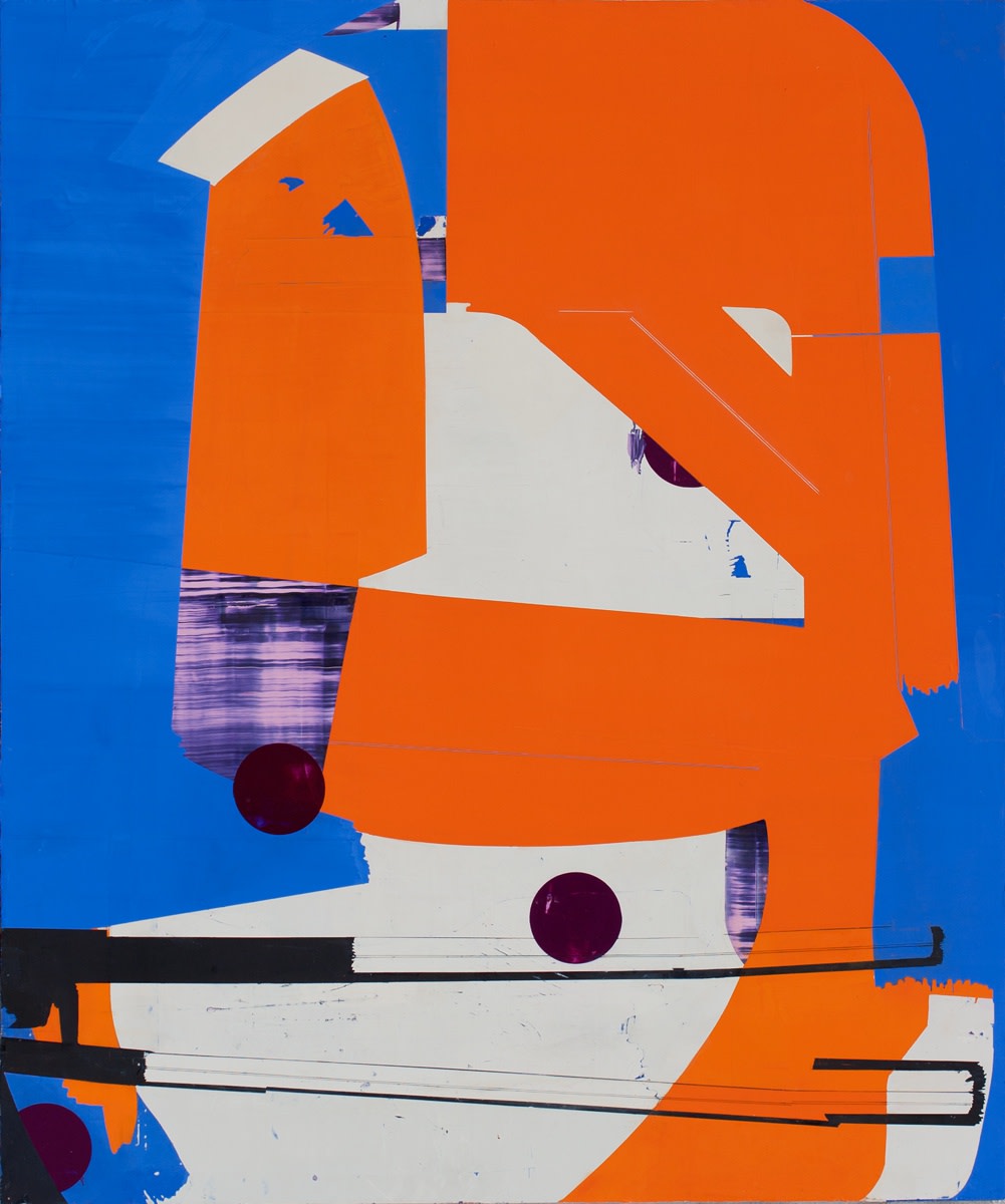
"Aftermath"
Also, I am making efforts to incorporate a more obvious balance between the painterly and the hard-edged. I don't want my work to be seen as pure formal abstraction. While my work has a tight, hard-edge quality, I don't want to feel completely bound up by that kind of precision. I want there to be a quality to my work that is free. The large expanses of color allude to freedom in a way, but I also want to bring a gestural component to the work that expresses a painterly freedom. It's about balance. People are complex. I'm not one way. I want my work to reflect the complexity of who I am.
Explore more of Suzanne Laura Kammin's work here.
"I Am That" is on view from February 18th through March 26th.
Comments
Always interesting to hear what inspires an artist. Great interview with great paintings. Congratulations on the show!
Suzanne's work as an artist and teacher have truly inspired me. I expect her show to do the same.
I enjoyed this interview and a lot of Suzanne's comments resonated with me. Good luck - the work is great.
What a wonderful interview and some gorgeous paintings to boot! Thank you.
Sarajo
