-
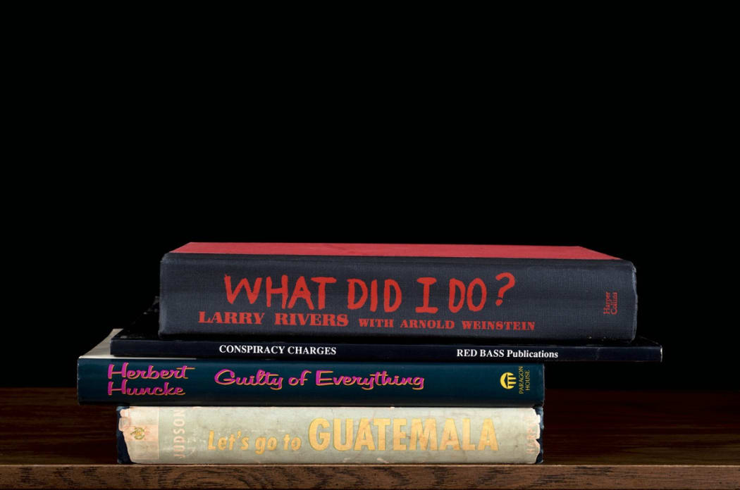
 Detail of Nina Katchadourian's "What Did I Do?"
In conjunction with her solo show, "BTW," Deborah Zlotsky is also curating a group show titled "STACK." The word “stack” has many meanings, like voluptuousness (stacked), worthiness (stack up), and exploding in anger (blow your stack). With today's political divisions, the connotations lead quickly to “stacked against,” using power in a partisan way to force someone to do something or to tip the scales in favor of one side. Stacking, as a provisional and daily tool, creates order, minimizes sprawl, gives us agency and authority. It provides us with a feeling of empowerment and control. These themes are interpreted throughout the works on show in "STACK." We asked Zlotsky about what inspired the show and what her curatorial process was like as we start preparing for the openings of "BTW" and "STACK" on Thursday, May 11th.
-
 Detail of "Blue Shade," Susan English
We're pleased to announce we're now representing Stanley Bielen, Nancy Cohen, Susan English, and Ryan Sarah Murphy!
-
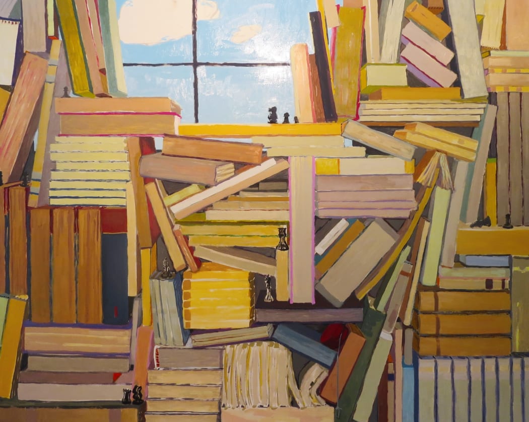
 Detail of KK Kozik's "Czech", 2015
Marilla Palmer on "Space, Light, and Disorder"
A Conversation With the Curator of Our Latest Exhibition"Space, Light, and Disorder" is our current exhibition exploring the relationship of artists and chaos. The group show is curated by one of our gallery artists, Marilla Palmer, and we asked her to discuss her process of creating the show and her insights into what you can expect.
-
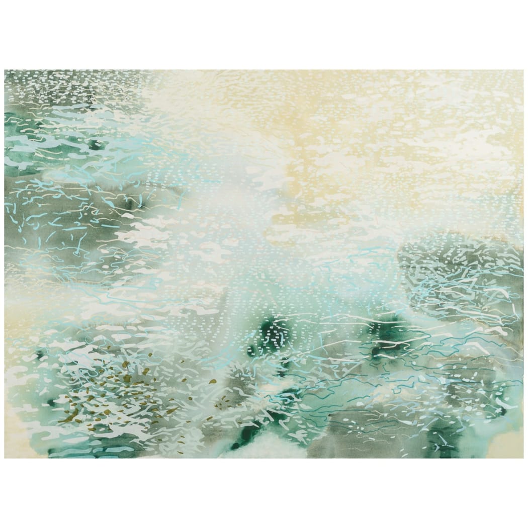
 Laura Fayer, "Coral Grove"
Every week, we'll be sitting down with one of our gallery artists to discuss their work, process, inspiration, and stories. This week we're speaking with Laura Fayer.
Laura Fayer's studio is nestled in her classic apartment in Jackson Heights, Queens. It's clear from the moment you step inside that one of the driving forces of her work is color. Bright paints, palettes, and mixed pigments cover the work tables, an index of colors stands at the ready to be sorted through, and ideas for inspiration are tacked on the wall. Printmaking tools sit next to Japanese rice paper, and stacks of sketches lay in wait. We sit down to discuss how all of these elements come together in her deceptively complex work.